Methods Used: Competitor Audit, Secondary Research, Screen-Flow Diagram, Low-Fidelity Prototyping, High-Fidelity Prototyping, External Critique, User Journey Mapping, Metrics-Driven Implementation Planning
Tools Used: Google Analytics, Salesforce, Constant Contact, Otter, Sketchbook & Pen, iMovie
Key Themes: Multi-Touchpoint Experience, Building a Community, Empathy-Driven Strategy
An initial sketch and final version of my welcome screen
Reflecting on our Strengths and Weaknesses
I was part of an extremely creative and reflective team on this project, which presented many opportunities and some challenges. We asked ourselves a lot of questions throughout the process, and we tended to answer those questions by (i) brainstorming a huge number of relevant ideas, (ii) putting those ideas either onto a whiteboard mind-map or onto post-it notes for affinity diagramming, (iii) pausing for silent reflection, and (iv) having an in-depth discussion about the pros and cons of our favorite ideas. This was a great way to come up with high-quality, well-motivated ideas, and we learned a lot from each other by talking through our processes. The downside was that it took a lot of time and that it sometimes left us with an overwhelming number of ideas we liked. But being the reflective group that we were, we recognized these challenges and came up with solutions. Many of the steps described below helped us save time and focus in on our best ideas.
Empathizing with the Client
Our client came to us because they had an app idea: a round up app (similar to Acorn) that donates the extra change from users’ purchases to the Minnesota Environmental Fund. They were clearly excited about the app and we thought it had potential, but we were aware of several more established competitors, so we had to think carefully about whether the app was really their best option. We ultimately embraced a version of the app idea that we called Local Loon, but only after our research revealed some ways the app could get a leg up over the competition.
My sketches and corresponding digital prototypes for the deals tab
I gathered and presented the analytics above while my teammates focused on competitor research.
Utilizing Secondary Research
We had a lot to do in little time, so we decided to lean heavily on secondary research. The client had a lot of analytics for us to look though, and we did a deep dive into round up app competitors. Our research pointed toward three ways Local Loon could distinguish itself from similar apps:
We wanted to make it a local “Twin Cities thing” because our research suggested that our target users care deeply about Minnesota.
We discovered that our client had a huge network of contacts and supporters, and we wanted to leverage that.
Most of their website visitors were young people looking for things to do, so we wanted to tie events and activities in with the rest of the app.
Early sketches of various touchpoints, including the initial pitch for Change for Minnesota and a note to myself in the margin for Cash Forward
A Win-Win-Win
Our client suggested we could incentivize users to continue using the app by rewarding them with items in a game similar to FarmVille, but we were concerned that this would exceed their budget and that it wouldn’t be enough to draw in new users. We kept a simple gamification element in our final proposal, but the main incentive we relied on for new users was economic (great for young users in debt!): users could save money by using the app. I thought about local coupon books like Chinook Book and suggested that partner businesses would likely be willing to offer discounts to app users in exchange for the kind of promotion the Minnesota Environmental Fund would be well-equipped to provide. This deal could take a lot of forms, and I recommended three of them:
Free coupons: these are intended to get people to download the app. Users can use the app to access a selection of one-time-use deals from local partners. For example, users could get 10% off at a restaurant chosen from the list of partners.
Change for Minnesota: if users sign up for a round up program that gives their change to the Minnesota Environmental Fund, then they get $1 back from each purchase with a local partner. Hence, users save money as long as they are shopping within the Minnesota Environmental Fund’s network of partners.
Cash Forward: if users agree to give 2% of their purchases to the Minnesota Environmental Fund, then partners offer them a 3% discount. Again, users save money while shopping within the network of partners.
Our client asked for a win-win solution, and we gave them a win-win-win: partners get cheap advertising and visibility, users save money, and the Minnesota Environmental Fund gets money for its cause.
After using post-it notes to construct a screen flow, we made a digital version of it
Prioritization and Scoping
We had a lot of ideas and we needed to make some decisions about what to prioritize in the app. To do so, we sketched quick low-fidelity prototypes of our favorite ideas, discussed their feasibility, and picked the best. Then we put together a screen flow (like a site map) to see how they would fit together and whether we were missing anything. A “Champions” feature we were rather fond of didn’t fit in well with the other features, so we cut it for a more unified app. After we had a good idea of which pages were most important, we decided on a color scheme and navigation style (via parallel prototyping), then split up the pages for high-fidelity prototyping.
External Critique
We presented our strategy to designers outside of our team to get some feedback. We felt this was an especially important step since we were relying on secondary research and we had not yet decided how to present our strategy to our client. We received a lot of great advice, including some new suggestions for how users could be introduced to the app.
Me explaining my team’s strategy statement to fellow designers
User journey map that helped us prioritize prototyping projects
Other Touchpoints
We had some low-fidelity prototypes for our other touchpoints, but we wanted to develop some of them. We used our user journey map to help us determine which ones required more fidelity to communicate our strategy to the client. Then we made a video that explained our design strategy and followed a persona through the various touchpoints in our user journey. I supplemented the video with an implementation plan (shown below) that includes a timeline showing when to finish each part of the design strategy, along with metrics to evaluate the project along the way.
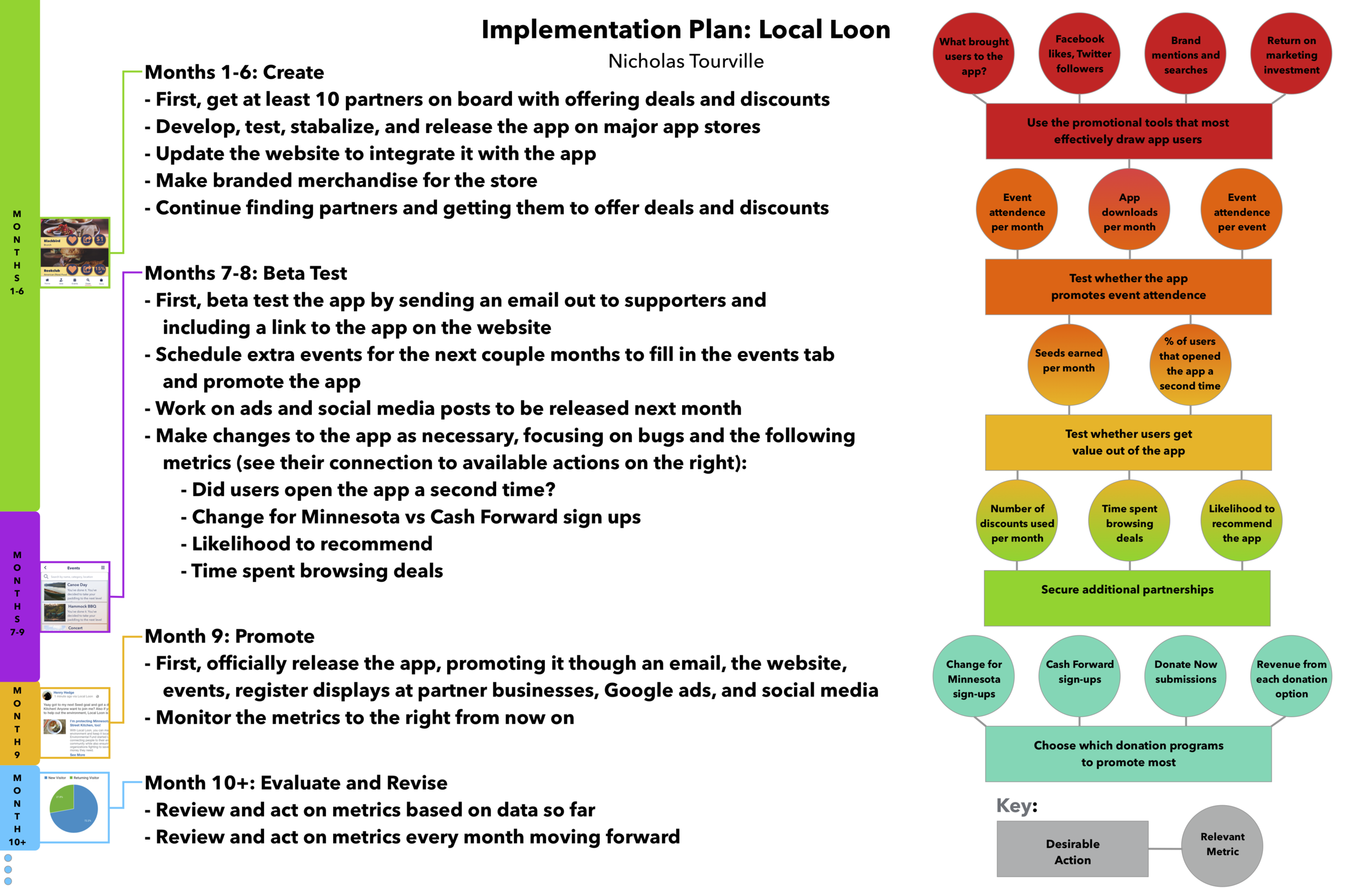
Gives a timeline for how to implement the design strategy, along with some metrics for evaluating progress along the way